THE SHADE OF IT ALL x WES ANDERSON
One thing is for sure, Mr.Anderson has GREAT TASTE. I recently made a Pinterest board dedicated to The Shade Of It All — my version of shade should be the new universal version of “shade”. My definition of “shade” are a REALLY PRETTY, artfully decorated, creatively painted, skillfully designed awnings. That’s right you heard me, an awning. And every time I found one I really liked it reminded me of Wes Anderson. Because an awning is sort of like an accessory to a building. It’s pretty and decorative (sure it serves a purpose, but you can certainly have a building without having an awning) and it’s just a wonderful additional accent to add.
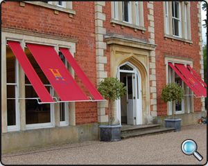
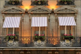
Aren’t these exteriors similar to ones you’d see in a movie? They just give an extra hint, of like, “hey, I care about how this place looks” to any house, or storefront, or building, or hotel. I’ve been wanting to break down some of my favorite elements of two of my favorite things, movies and design, and figured I could do it best whilst commenting and awing at the creations of Wes Anderson. Kill two birds with one stone, so to speak. Doesn’t this sound fun? I think it sounds SO FUN! We’re starting from the beginning. Get ready to drool.
BOTTLE ROCKET
Wes Andersons first feature film.
Amazing.
Hilarious.
Thrilling at times.
Darling, it’s just full of greatness.
It was a preview of what was to come — and it was amazing.
It also gave us our first taste of his taste. This was his first feature and made for very little money so the design and the set isn’t what his films have come to. BUT he certainly asserted his taste and his knowledge of color and style.
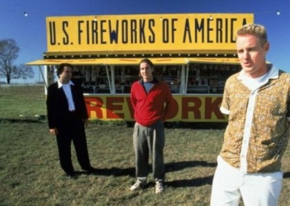
THAT YELLOW AWNING AGAINST THE BLUE SKY. THE RED JUMPER AGAINST THE YELLOW AWNING.
Then came RUSHMORE
Another gem, another fav.
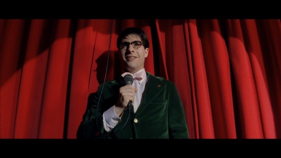
I have to stop and talk about this still from this movie for a moment, because it’s so RICH it’s sick. The heaviness of the curtain in like, weight, and texture, but also in color. It’s just beautiful. People are afraid of red, but this is so beautiful and such proof that red should BE INCLUDED in everything. Don’t be scared BBs, don’t be scared! Do a red accent wall, or red curtain, or red awning! Bring it into your life in a BIG BOLD BRIGHT way.
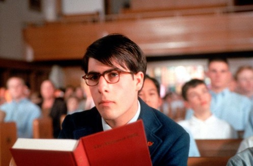
Here again. Muted colors, pastels, and softness in the background. Then, sharpness in the foreground. The book being the focus, just a sharp pretty red. His dark blazer: stiff, constricting, sturdy. The contrast is so so great. Clearly the star of this moment is in the front, and honestly, you are the STAR of all of your moments, of your whole life, so be the one in focus. Be the one in something bold and strong, and different. That red book could be a red iPhone cover for all I care, just something unique and to bring attention and eyes to what you want. Learning what people look at and what compares and contrasts is so powerful because it lets you not only dress yourself but design your whole situation. A pop of color here and there gets people looking. It shows them something a little different.
Then came THE ROYAL TENENBAUMS. Where do you even start? It’s too much goodness. I feel like he was finally like YES! I can do what I see in my head! It’s so so good. I have to cut myself off after a few photos because I could just copy and paste a link to some freaky website so you could screen the entire movie because from frame to frame, from beginning to end, this film is FLAWLESS.
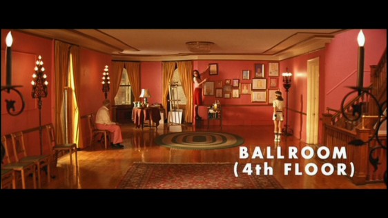
Oh you want to do an entire room pink?! OKAY! Go ahead!
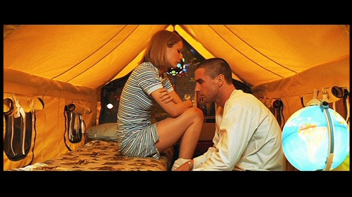
THE HONEY GOLDEN YELLOW! THE PALE BLUES. THE SORROW. THE LOVE. THE PAIN!
It’s too much emotionally, let alone visually.
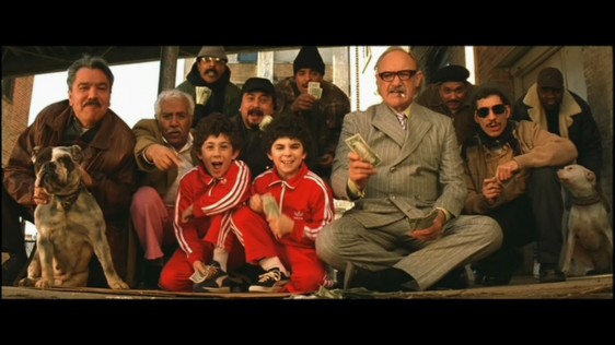
Again, don’t be scared of red. Look what it does to this picture. See where your eye is drawn, what you notice, what you stare at, what becomes the center? A little color does A LOT.
THE LIFE AQUATIC
BEAUTY BEAUTY BEAUTY
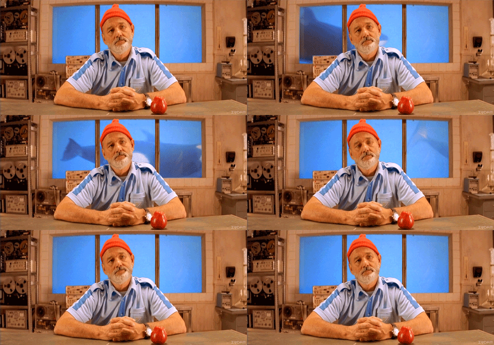
Blue on beige on red. Look what you focus on, first the apple, then the shirt, then the beanie, then the ocean behind him. Then, if you go back for a second round of intake, you notice all the stuff around him. Do you get it yet? Your focus is pulled and controlled by color. This happens in rooms, in clothing, in set design, it happens everywhere. And once you notice stuff like this you won’t be able to stop. I know I can’t. So you really have to think about how you curate your spaces and your person…curate your person? Is that a real sentence? You know what I mean!
THE DARJEELING LIMITED
Where do we begin with this movie? Where do we end with this movie? It’s in India. The color is overwhelming it’s so beautiful. The costume, the set design, I mean this is all getting old, because he’s just so good in every movie he makes. They’re all special, and they’re all unique, but they’re also all similar, because they’re all him.
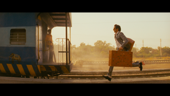
Nothing to say about this because YOU HAVE EYES.
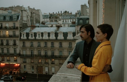
Again, not a lot to say here. You get it. The robe, the light, the hair, THAT RED AWNING IN THE BOTTOM LEFT JUST MAKING IT PERFECT!
MOONRISE KINGDOM
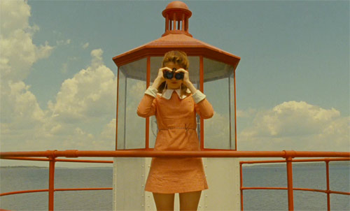
This movie felt really different. It was a different texture than the other ones. Older seeming maybe? Grittier? But nonetheless amazing. The shapes of the light house and the shape of her dress. It’s all so meticulous and perfect.
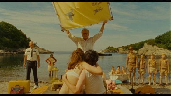
EVERYTHING IS AMAZING. I WANT TO OWN ONLY YELLOW ACCESSORIES NOW.
Now finally, The Grand Budapest Hotel. His latest adventure. Have you guys seen this yet? GO NOW if you haven’t. This is one that you should enjoy on a big screen with an audience.
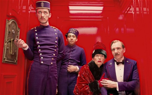
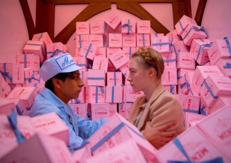
I can’t say enough about the JOY I get from looking at these photos. It’s eye-porn. Is that a thing? I think it is. Just so much to look at. So much to marvel at. So much to appreciate!
Go through these photos one more time. Go through the Pinterest on awnings one more time and be totally inspired like I have been. THEN go ahead and create something special for yourself. Tweet me the pics, I want to see what you guys can do! I believe in you!
xx
DB
